A couple days back, I received an ask from an anon asking how I create the background images I use in my games, mostly my visual novels. It got much longer than I was expecting, and felt substantial enough to mirror to my main blog as a full tutorial.
So, here it is. Enjoy.
There’s two effects I use for backgrounds in my games, and I’m going to roughly split these into “adjusted” and “dithered”. We’ll start with setting up the image itself.
Setting up Background Images
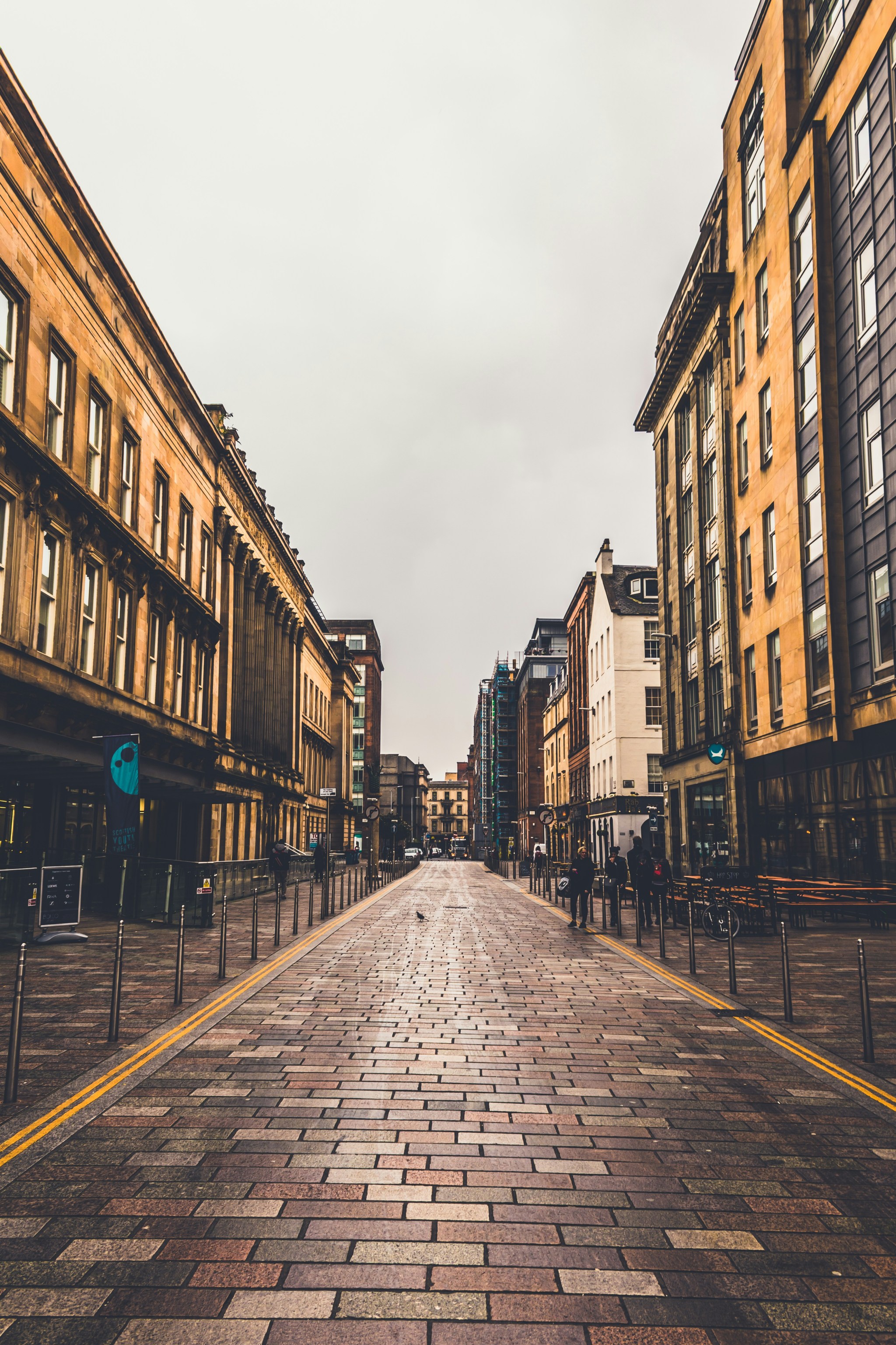
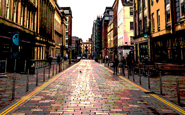
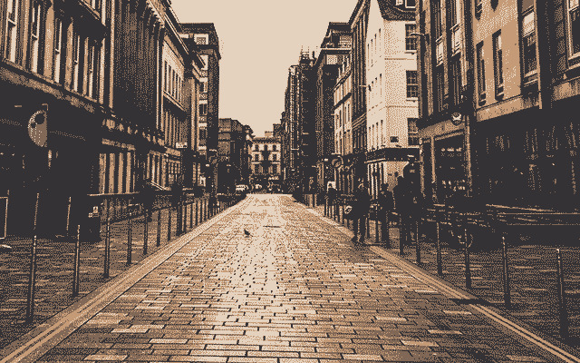
I either get images by just photographing things myself, or using royality free image sites like Unsplash or Pexels. What I use is down to whatever I’m looking for. Let’s start with this one.
I use Photoshop for this, but it can be easily done in Photopea and other raster image software. I’ll be using Photopea for this part just to show you can do this with free options.
For Videotome specifically, the first thing is to reduce the image size to the size of the Videotome canvas. The default size, if you haven’t changed anything, is 640x400. The easiest way is to set up a new project as that size…
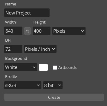
And then importing the image into that. Resize the image as you see fit.
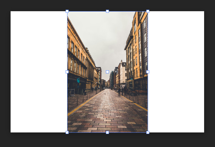
For simple backgrounds, that’s it. You can export this as a png and that’s ready to be used in Videotome.
For other engines, it’s a simple matter of checking what size your engine needs, and if it only accepts certain types of image files.
Since a lot of the editing I do is deliberately making an image lo-fi or pixelated, even at higher resolutions, I usually don’t care about resizing artefacts or blurriness, since they get swallowed by edits.
Adjusted Images
I call these “adjusted” because, if you can believe it, we’re going to be using various image adjustments you can find in Photoshop/pea. The method for all of these is the same:
-
Select the image
-
Go to Image > Adjustments
-
Choose the adjustment you want from the list
-
Change the parameters to your liking
-
Hit accept; the adjustment is now set as a layer mask, and can be edited again to your liking by double clicking the mask
I won’t waste your time with all of them, but here’s ones I use a lot.
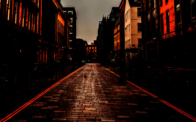
Posterise
One of my favourites. Reduces an image down to a specific number of colours, based on what level you set it to. I usually do between 3-5. Everything in Quinn & Flynn was done with this.
Levels
Something I use a lot as a first step, and then use another adjustment ontop of it, usually posterise. Really useful for changing the light of a scene if you want to give the impression of a picture at a different time of day.
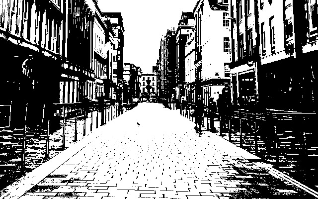
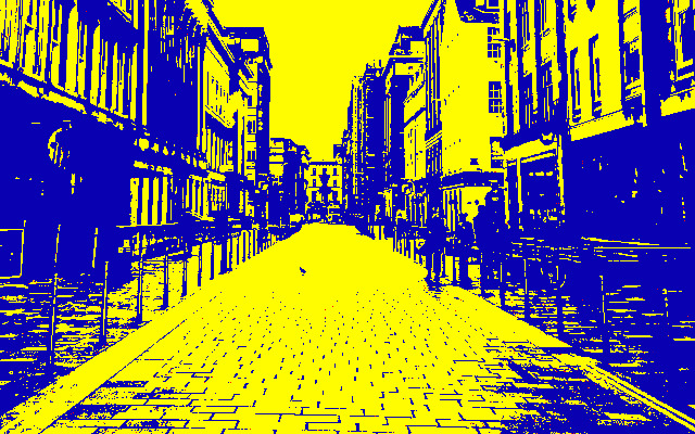
Threshold
It’s been a while since I used threshold, but I really enjoy the effect it has. Because it reduces an image down to black and white, it’s very easy to recolour these to a two-tone image of your choosing.
Experiment!
I get the style of images that I do by messing around and seeing what sticks. Play around with filters, adjustments, or whatever else you find. Combining some together, and what order you combine them in, may give you a style you didn’t expect.
Dithered Images
Dithered images are a bit more involved. There’s several ways you can do them, and all of them have varying levels of complexity and control over what you make. All of them work from an image that’s been resized to your needs.
Photoshop’s “Save for Web”
The main method I use is using a legacy export feature Photoshop has. If this ever gets removed I’m fucked, but I also refuse to upgrade from 2020 so I don’t care.
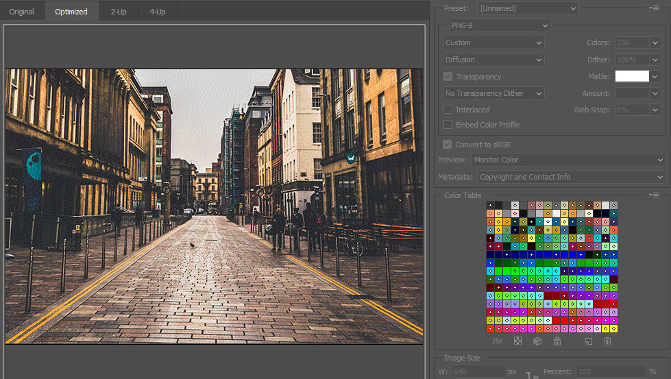
Go to File > Export > Save for Web (Legacy). This will give you a screen with a lot of settings on it.
First, change the file at the top from GIF to PNG-8. What this file format is doing is reducing an image down to a specific number of colours (called a colour table). For reasons beyond the scope of this tutorial, exporting web images with specific colour restrictions was important back in the day. We are no longer in “back in the day” times, hence this being a legacy feature.
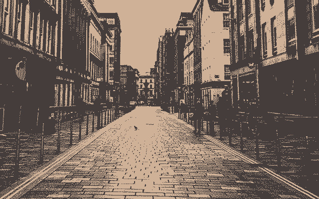
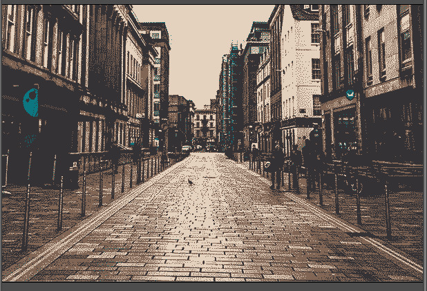
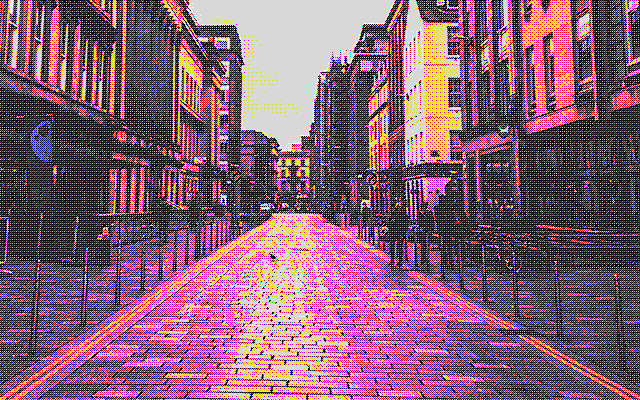
If you zoom in on the preview, you can already see some dithering! With this many colours, however, it’s not that visible, and we want the dithering to be pronounced and obvious for the style we’re going for.
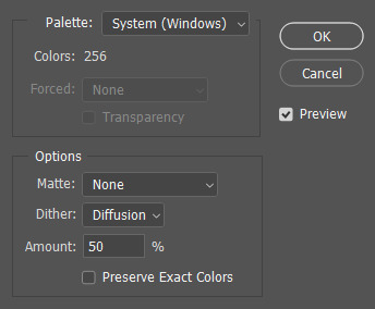
To adjust this, set the number of colours from 256 to whatever you like best. For the classic Obra Dinn look, for example, that requires 2. You can also change the dithering percentage to your liking. I usually stick it around 90%. You can also also change the dithering style between diffusion, pattern, and noise. I usually use diffusion, but pattern is also nice for a more “computerised” look.
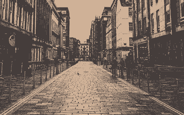
This now brings us to colours. By default, Photoshop is taking whatever colours are present in the image, and after some maths, creates a colour table from colours that are the most frequent.
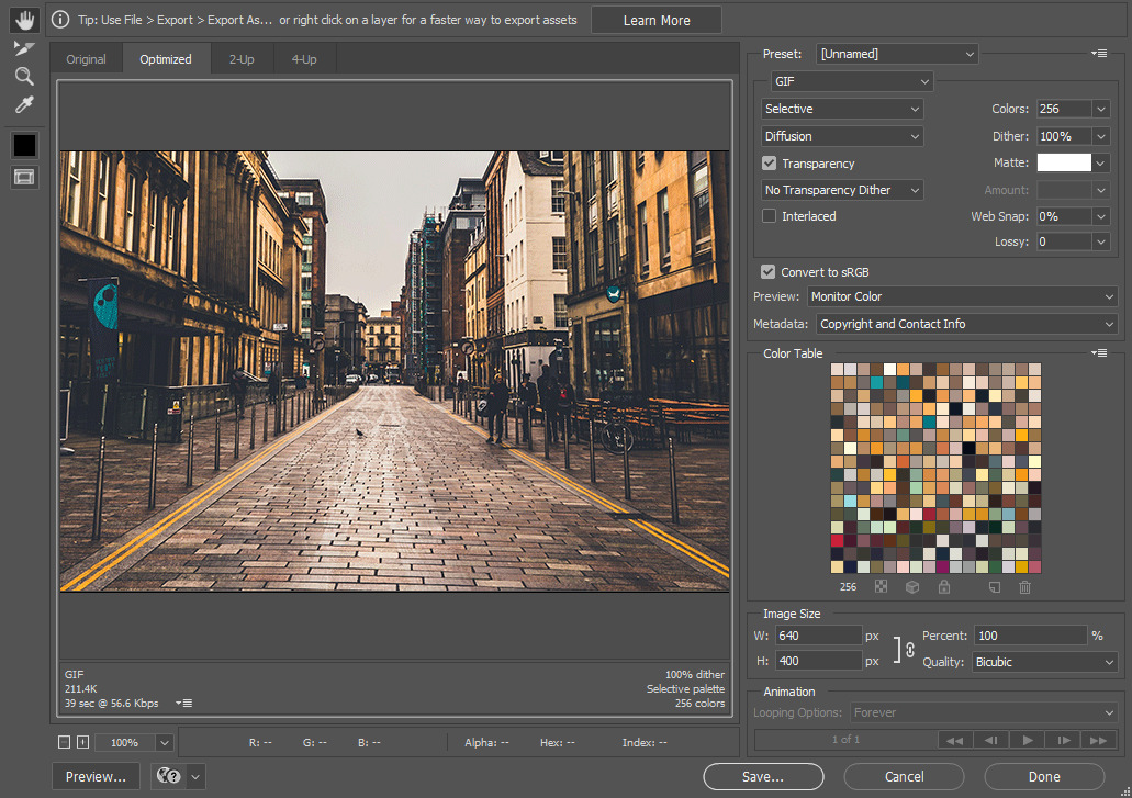
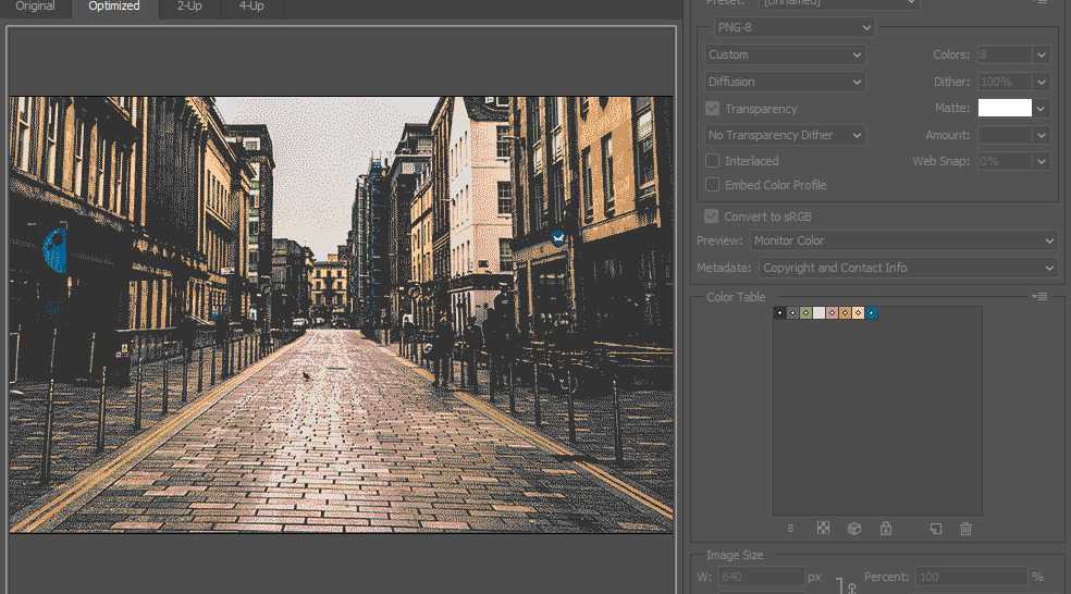
Because this is automatic, at lower colour numbers this can have some unwanted effects. Take this example at 4 colours:
The image is effectively monochrome, and other colours have been swallowed by Photoshop’s algorithm, since they don’t appear as frequently. Fortunately, we have some ways to adjust this.
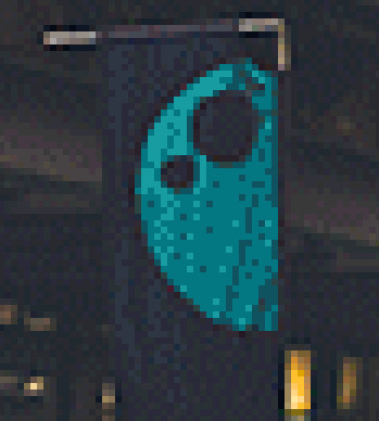
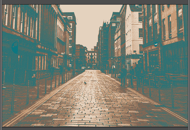
For example’s sake, I want the blue found on the banner and sign to stay around. If we go to a higher colour number, in this case 8…
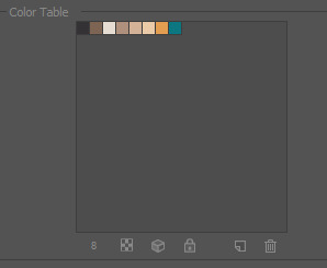
We can see the blue comes back on the colour table. Now what we can do, is select the colour and lock it using the buttons at the bottom.
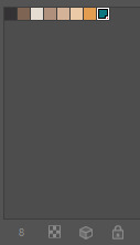
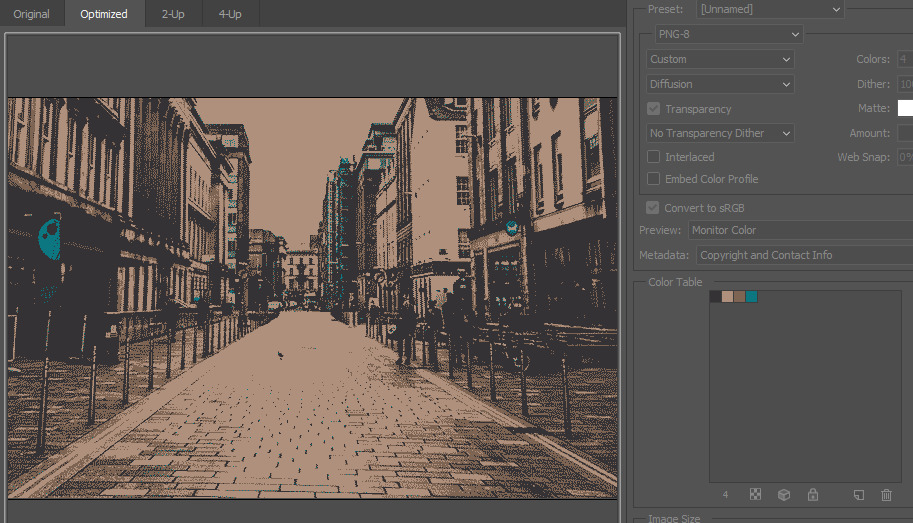
Once we reduce the number of colours to 4, we now have an image with the blue back on the banner.
Also note that Photoshop uses this blue on the sign on the right, and also on the scaffolding in the back. If we look back at the original image, that right sign is in fact blue, and the scaffolding actually has a green-blue netting covering it. I quite like when things like this happen, but if you’re strict about only wanting a specific colour in one place there’s nothing stopping you from editing the image futher once you’ve exported it.
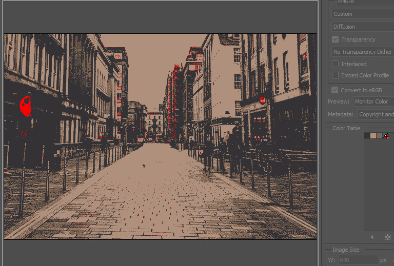
Sometimes, locking a colour causes unexpected behaviour. I lied to you a little, because when you actually lock that blue and change the number of colours to 4…
It looks like this. The blue is being used as the darkest colour, and the others are light tones taken from the image. I’m not a fan of that, so what can we do?
An easy way to mess with this is to bring the number of colours up, and then deleting them using the buttons on the bottom of the colour table. Rather than recomputing the whole image, like when we’re adjusting the total number of colours, this selectively removes one colour from the table, and uses whatever’s left in the table to fill out the image. If you specifically don’t want light tones in your image, for example, this is one way to do that.
You can, also, change a specific colour in the colour table, but this may not work as you expect! If you adjust one of the colours, it recolours the computed colour. It doesn’t recompute the whole image using that as part of the colour table.
If you do want to force a colour table, discarding the colours on the original image, you can do this in the dropdown menu on the colour table. Changing the number of colours works off this new colour table.
In this dropdown menu you also have the choice of saving the current colour table to use at a later date. This is useful if you have multiple images you want to export with the same settings.
Unfortunately, using Save for Web, there’s no way to create colour tables from scratch, and you can only use pre-made or saved ones. If you want to make your own, however…
Photoshop’s Indexed Colour
This is, effectively, the same method as above, but with less options and less control. It also doesn’t preserve the original image, which you may want. However, it does have the upside of being able to create colour tables from scratch, which is good if you want to force a specific style on multiple images without really caring about preserving specific colours from them.
Go to Mode > Indexed Colour. It will ask you to merge layers, which you need to do.
Here, “palette” means colour table. On the dropdown, Local and Master use the same method as Save for Web does, pulling colours from the image itself, and you can change the number of colours as you wish.
The important thing to note here is that this mode will use every single colour available in a pre-made colour table. For example, if you use the Mac OS colours, you cannot use anything less than the full 256, which is annoying. The real strength of this method is the option to create custom colour tables instead.
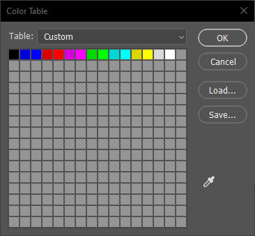
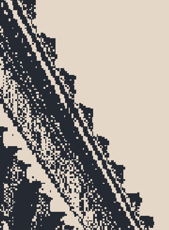
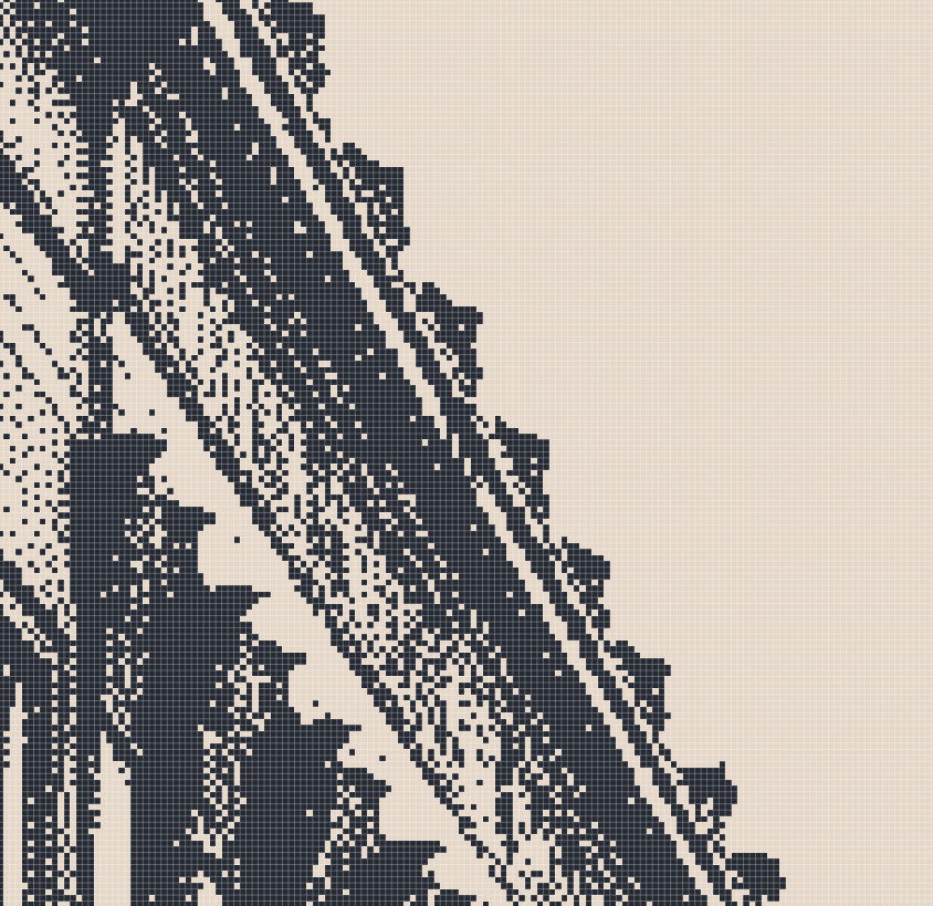
This screen can be a bit finicky to use, but it works. Click a colour to change it, and ctrl + click to delete it. You’ll be surprised how close you can get to the original image with a small number of colours, particularly when you mess with the dithering pattern.
It’s possible to export a colour table from here, and then load it into Save for Web if you wish.
Unfortunately, you cannot use either of these methods in Photopea. You should, however, be able to do this in Photoshop 7, which is available on archive.org as abandonware.
Other Dithering Tools
Ditherpunk is pretty popular as a style, particularly in the weirdo game circles I run around in. Because of that, it feels like every programmer and their mother has made some kind of image dither tool. They also typically have a lot more control over the actual dithering function, with far more patterns. You can just search for dithering tools on google or itch and see what hits you get. Here’s some I know of and have used myself.
-
Pic2Tic, my personal favourite
-
For the programmer-inclined, Surma’s roundup on dithering is useful for making your own tools
General Dithering Tips
It’s important to note that dithering will come out pixel-exact. If you have an image at 1920p, for example, the pixels won’t be too pronounced.
If you want to make your pixels bigger, instead create your canvas at a size divided by a multiple of two. So, if you wanted your pixels on a 1920x1080 image to be twice as big, create a canvas that’s 960x540. Scale up the image by however much you divided by for the final export.
Make sure that divider is a multiple of two. If you don’t do this, when you scale your image back to the original resolution, the pixels will be distorted.

Also, when you are scaling, make sure to use Nearest Neighbour. Using smoothing will destroy those lovely sharp pixels you spent so long creating.

GO FORTH
These are just the methods I use, and there’s a million and one ways to do anything. I like using Photoshop, but there’s always free substitutes to any tool.
The only real way to play with this style is the simple adage: fuck around and find out.